Significant logo for a major educational institution
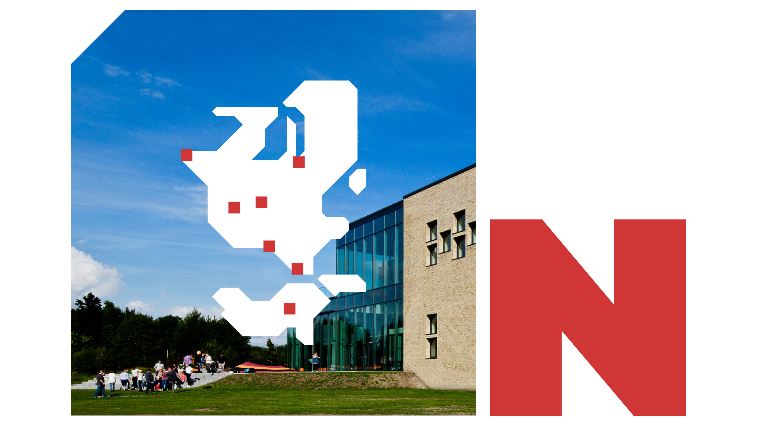
University College Absalon’s new design is developed based on thorough research and analysis of the university, Danish archbishop Absalon, as well as conversations and dialogue meetings with the university’s management.
BGRAPHIC has designed a logo and a visual identity that is both significant, informal, and playful. Our focus has been to create a recognizable visual identity at a time when a renaming of the university needs to be established among students and the public.
The new design brings a renewal to the university and the way it presents itself. By unifying and standardizing the design, the organization gains a cohesive identity that strengthens and presents their feeling of community and brand.
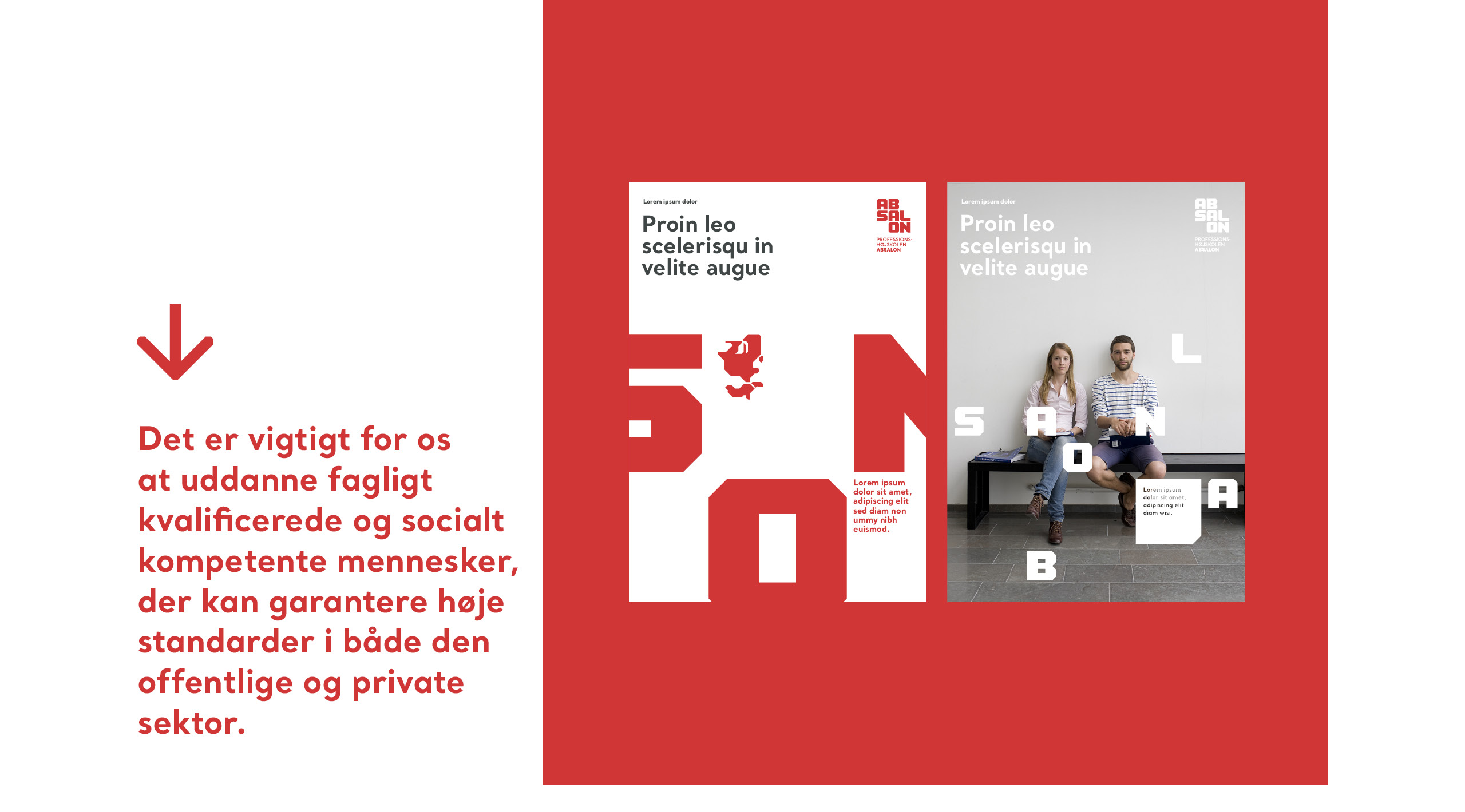
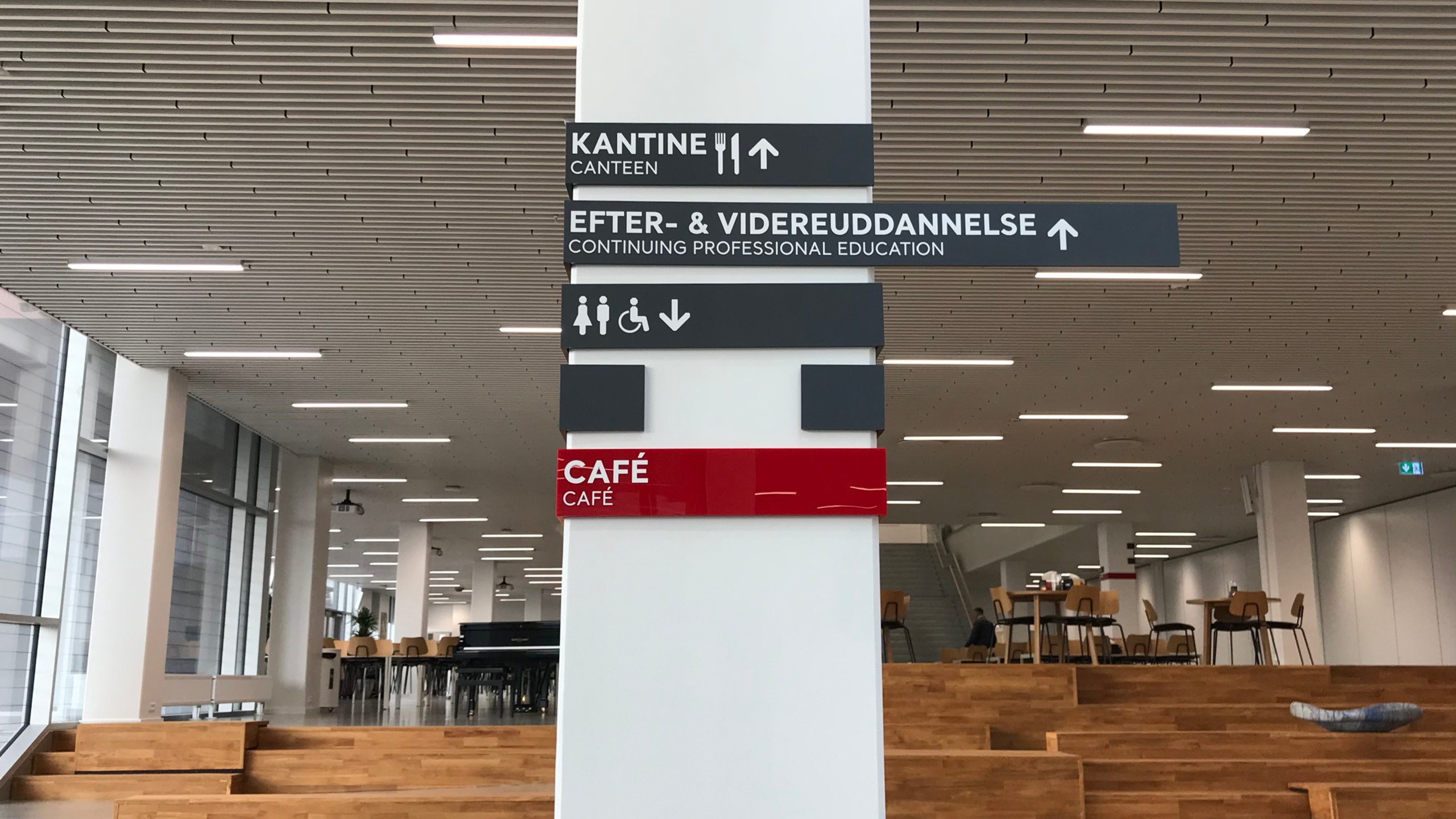
This visual style also serves as the foundation for Absalon’s entire icon and illustration universe. We have designed more than 70 icons, which are used throughout their communication – on their website and for wayfinding at Campus Slagelse. Additionally, we have developed an illustration style with the same aesthetic, used for more complex subjects, such as teamwork in study groups. These illustrations are applied to roll-ups, PowerPoint presentations, various written materials, and TV screens on campus. Let’s just call it a ‘textbook example’ of alignment between identity and execution.
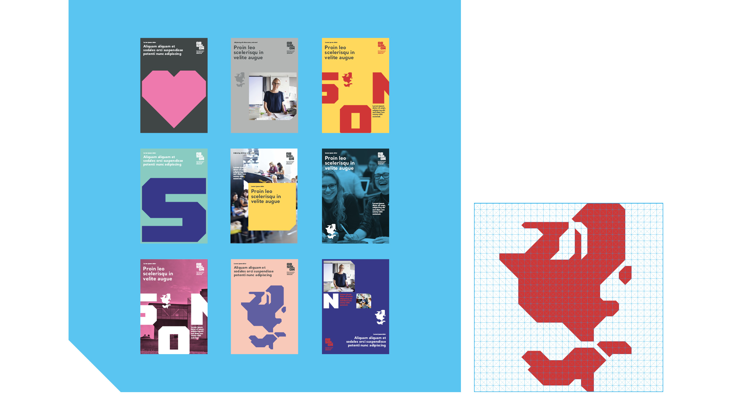
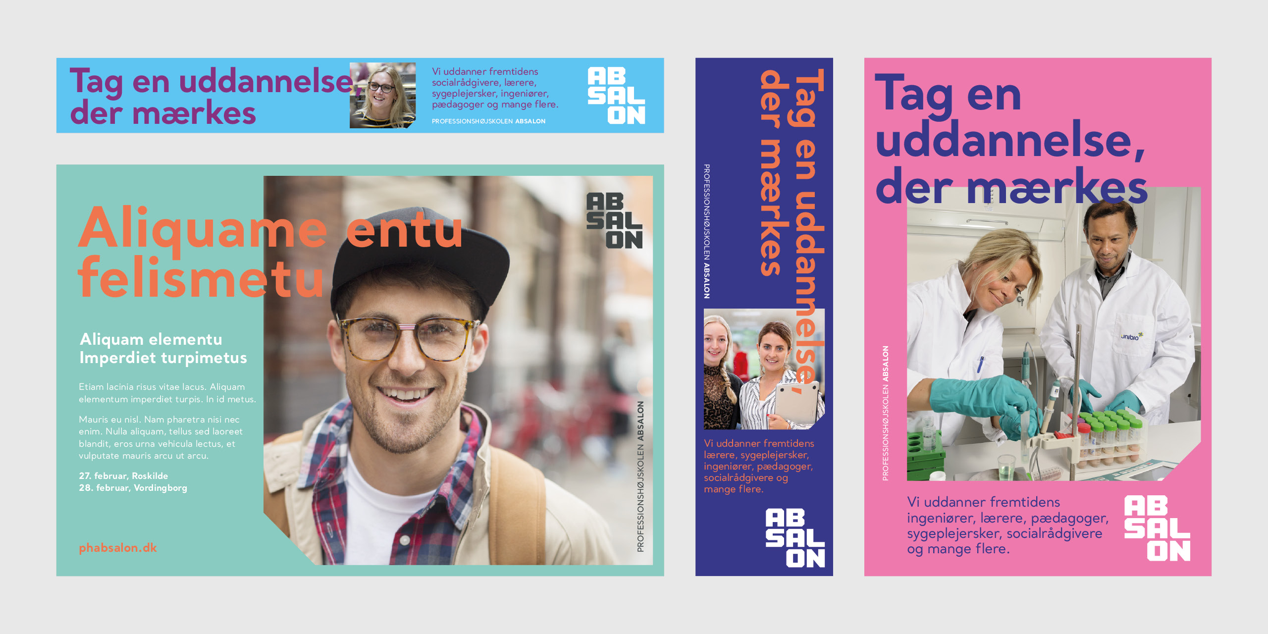
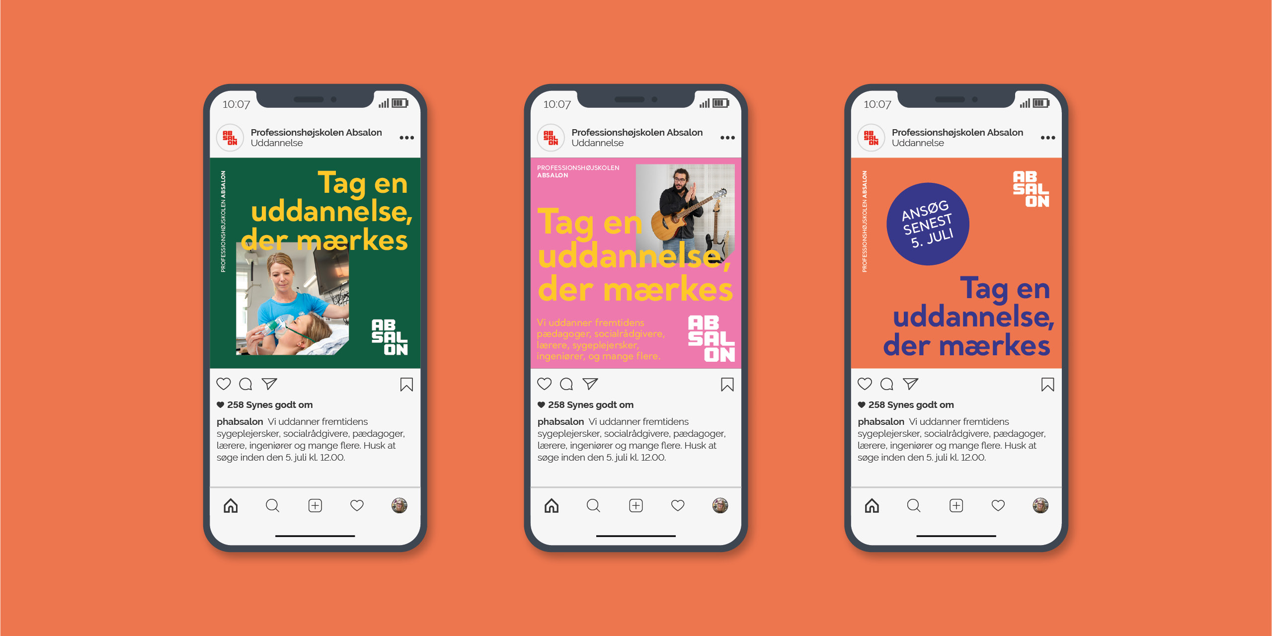
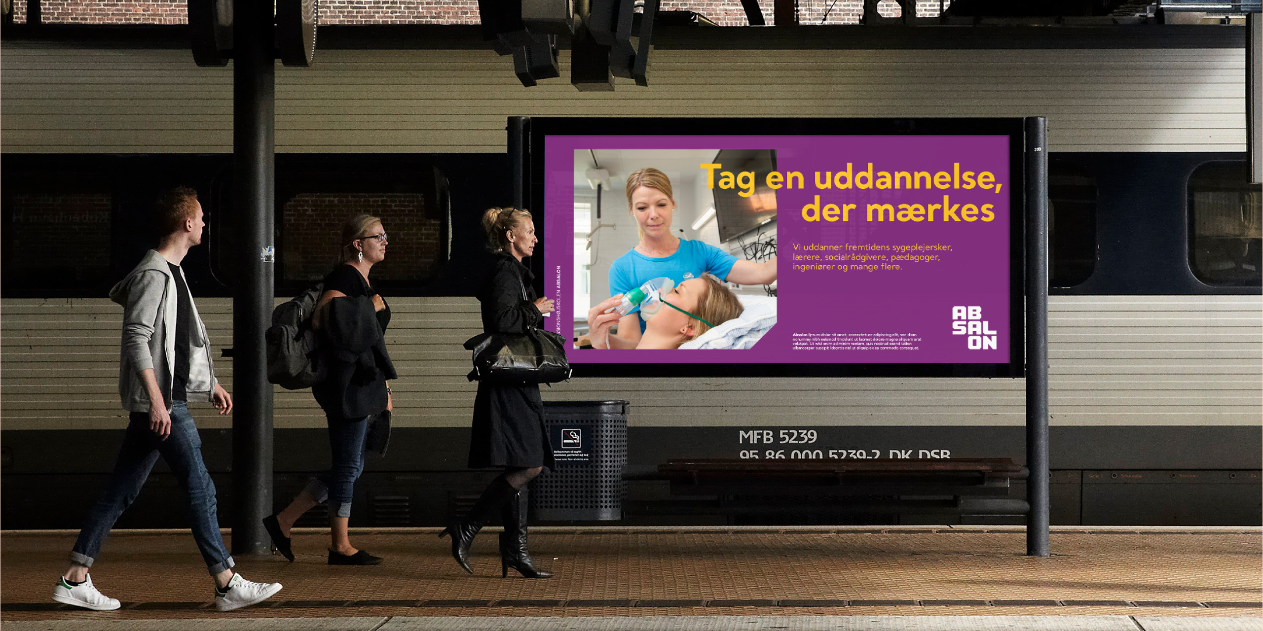
Absalon also has an ongoing need for campaign development to attract new students to its study programs across its six campuses in Zealand. In this regard, BGRAPHIC has created a campaign concept that extends from the visual identity. Each campaign has its own unique expression while seamlessly fitting into the university’s overall narrative. The campaign elements are used across social media, billboards, and other outdoor media.